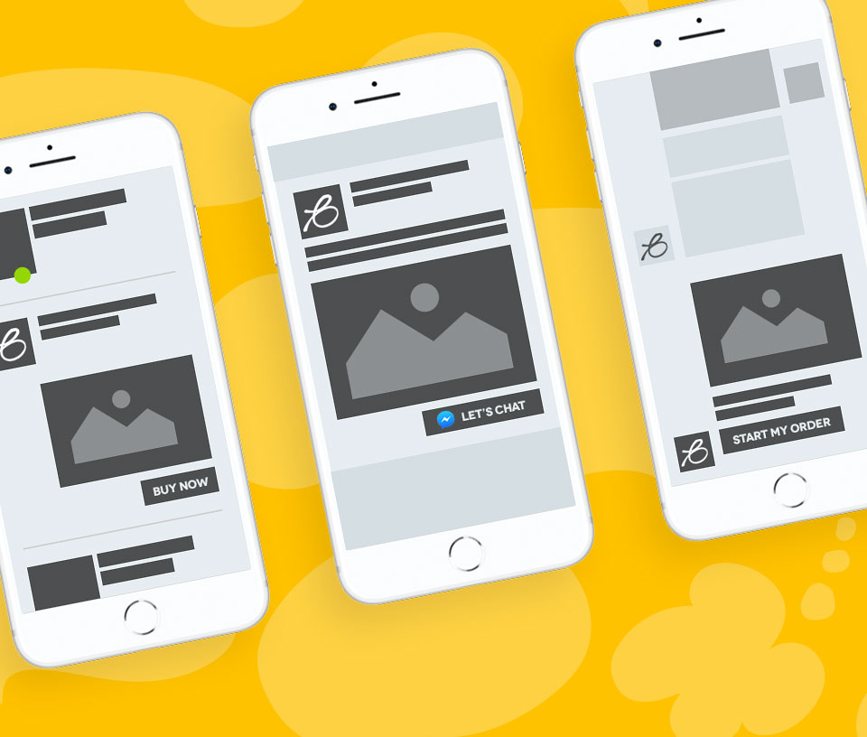
‘Above the fold’ was a simple term coined for printed newspapers. As newspapers are printed on large sheets of paper, they had to be folded in half for transportation and selling. This gave the papers a defined retail space to capture their audience and pull them in. All of the juicy goss’ needed to be in the top half of the cover, above the fold.

This term then transferred into a digital medium, where the proverbial fold was based on everything in your browser shown without scrolling. Back in the day of dialup internet (Mum, get off the phone I’m on MSN…) and standardised monitor sizes, this design problem was simple and easily catered for. Slower connections made the requirement of key information being shown above the fold necessary and knowing that 95% of your users would be using the same screen resolution making your canvas size almost guaranteed.
A changing landscape
Jump forward to 2018 and the digital landscape has evolved faster than your Mum can hang up the phone and you can reconnect back onto the internet. Smartphones, laptop, tablets, watches… in 2016 mobile phone browsing eclipsed that of its static older brother and is only increasing year on year.
This hasn’t made above the fold irrelevant but it has certainly changed the meaning of it and made the problem more complex. You have to be more considered in your approach and design for wider audiences across multiple screen sizes… But that’s what makes it interesting!
Define your audience
There is no hard and fast rule, every business and their audience is different. Start any website design journey by defining your audience. We talk about this in a previous article ‘Customer personas; the power of profiling’. Defining your audience allows you to determine their browsing habits, devices they use, problems they’re looking to solve and goals from their session. This can vary massively and should influence your website goals, site structure, content hierarchy and UI approach.
You have to be more considered in your approach and design for wider audiences across more platforms… But that’s what makes it interest!
Your gut instinct will probably be to hit them with a strong call to action above the fold… Now this is sometimes right and sometimes wrong. Consider whether your typical user is familiar with your business or if they’re new to you; would you buy something the moment you walk into a new store? Well maybe it’s a new store but you’re familiar with the brand and are buying a fresh pair of shoes to replace your old ones. In this instance you know your customer is a previous buyer and the call to action above the fold offers convenience to them. Now for the fresh blood walking through the door, it may put them off and discourage further interaction…
The false bottom
In a world of social media and infinite scrolling, it’s understandable to see a rising trend in website content being consumed below the fold. It’s not a given that users will scroll however, so you must give them a reason to or make them aware that there is more content. The ‘False Bottom’ is where there is further content on the page but the user isn’t aware of it. This is increasingly evident and important in mobile browsing. It may appear in ways as subtle as an image stopping perfectly at the bottom of the page, forming an aesthetically pleasing viewport that looks like a finished page. A simple workaround will be to reduce the images size down and allow the content to creep in at the bottom, making it clear there is more to see (a teaser!). This is serving the user over the designers portfolio but it’s a simple way to encourage users to scroll, allowing them to consume more information and make an informed decision about your company.
Do you have a new website project in mind or interested in optimising your existing site? Give Chris a shout on 01292 280022 or email Chris here.

