When it comes to critiquing the design of a website, whether reviewing a competitors or during the process of creating your own, we all get sucked in to the same traps; I don’t like that picture, not sure about that colour, how about a different font… This is why when starting a new website project, jumping straight into the aesthetics will limit the important discussions around user experience that creates a website designed to convert.

Now of course these elements are important with how the end user relates to your brand and content, however these are time-intensive to change across a fullset of design and shouldn’t be the starting point of your website. (Plus, you try and tell a designer to completely change the layout when they’ve poured blood, sweat and tears into every pixel!)
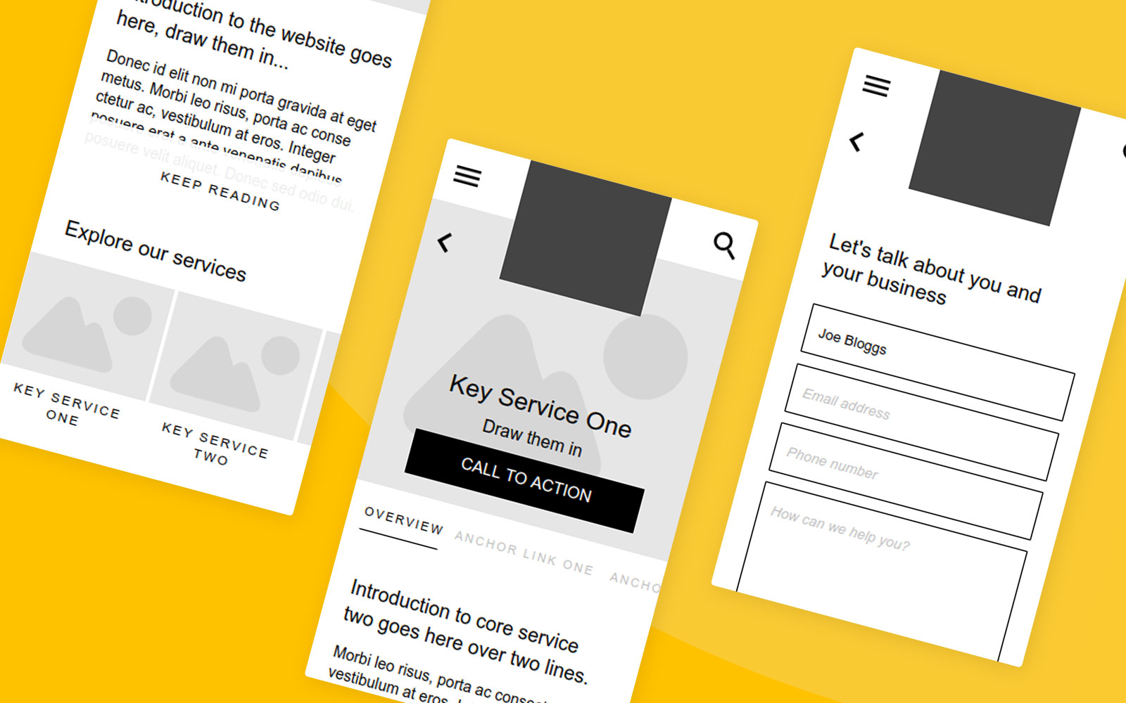
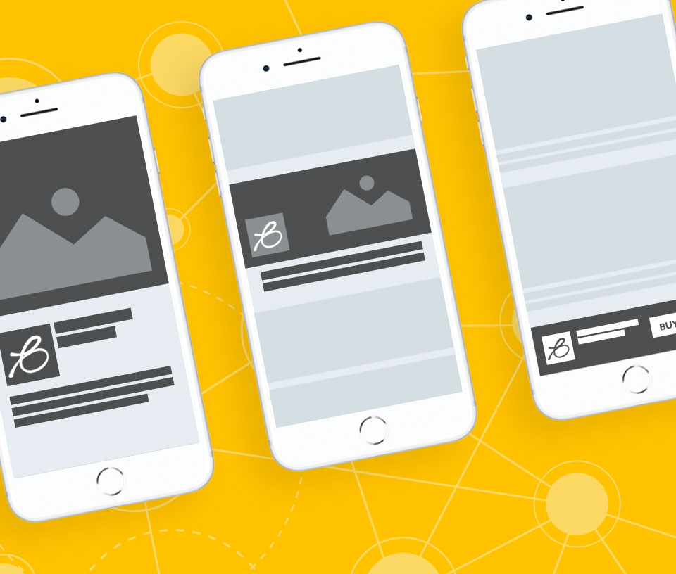
Let’s take for granted that the visual design of your site will be great… You’ve chosen an agency with a quality portfolio full of great designs, they’re creative and really understand your business. Now it’s time to understand your customers and what they want from your site, potential questions, problems and how you can answer them (for more about this, checkout a previous article on Customer personas – the power of profiling). Before you start getting into the (often subjective) realm of fonts, colours and images, keep your initial designs agile with wireframing.
Let’s take for granted that the visual design of your site will be great…
You’ll have heard of UX design (user experience design), that focuses on the usability, content planning, ease of use and interaction that a user has with your website. In essence, it’s a process dedicated to ensuring your users can get exactly what they need (whether they know what this is yet or not) as quickly and easily as possible.
Separating this process from the aesthetics of your website, allows you and your web designer to design, prototype, test and change quickly. These low-fidelity designs don’t take days of careful visual decisions, only to throw them out of the window because the navigation designed doesn’t meet your users needs or content structure. Wireframing gives you the ability to create rough and ready layouts quickly. Test the users journey and interactions with the website before you get into the more high-fidelity realms of pictures, colours and rounded or square corners (ooh tough choice with that one).
Keep agile with wireframes and give prominence to the user experience – your users will thank you for it!*
If you’d like to have a chat about your website project and how you can benefit from wireframing, give Chris a shout on 01292 280022 or email here.
*Not with like a thank you card or anything, but possibly with a contact form submission or meeting one of your other KPIs… Maybe they’ll send a card though… If not don’t fret, well send you one – all you have to do is ask.

