Here at Big Blue Dog, we love a throwback. Old baby photos, vintage trends, and this week, we’ve been discussing brand logos.
A brand logo is what represents your entire business, and if the logo is bad, people could assume that your business isn’t up to much either. Like trends, clothes, food, and pretty much everything else in life, brand logos do eventually go out of date. It’s so important to keep up, regularly update your logo, and keep your brand moving with the times. Let’s look at some examples of logos as they, in some cases unfortunately, once were…
1. Starbucks

The original brown logo pictured on the left, was an image of the “Starbucks Siren”. This originates from the Greek myth of Sirens, beautiful sea creatures that were said to lure sailors to shipwrecks. The relevance being that one of these mythical shipwrecks were located off the coast of Starbuck Island, South Pacific. Today, the world’s top coffee retailer have opted for a more vibrant, inviting logo.
2. Burger King
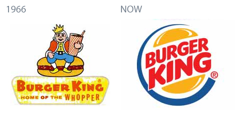
Originally named ‘Insta Burger’ – Burger King is one of the largest fast food chains. Did you know, rapper Snoop Dogg actually assisted with training Burger King employees? Their original logo, a king sitting on top of a burger, remained until 1969 until the ‘Burger King’ in a burger bun logo that has been representing their brand ever since, giving it a much more Global feel.
3. Nivea
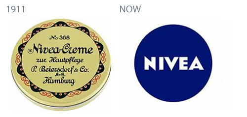
Nivea is a 125 year old skin care brand. The simple, yet eye catching logo that we know now is very different to their 1911 logo – an image of their very first box of Nivea cream.
4. Nokia
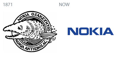
One of the largest mobile phone manufacturers, Nokia, chose this fish logo to represent their brand in 1871. The reason being that at the time, their offices were based in Nokia, Finland. The fish is in reference to the nearby river, Nokiavirta. At this point, they were actually manufacturing paper!
5. Doritos
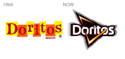
Doritos were originally produced at Disneyland, California in 1964, using tortilla chips that were unused. When this two toned logo was first introduced, Doritos only offered one flavour. As time has passed, the Doritos logo has evolved and changed in to a more powerful, bold logo – and they’ve spoiled us with more delicious tortilla chip flavours too.
6. Canon
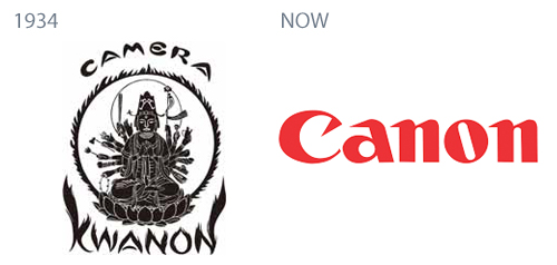
Canon, one of the world’s most recognised brands, didn’t always have the modern red logo that we know today. In 1934, Canon was actually named ‘Kwanon’ after the Buddhist Goddess of Mercy, displayed in their logo to the left. The whole point to this was that the name Kwanon “embodied the companies vision to create the best cameras in the world”.
7. Apple

Apple, the world’s most valued technology company, keep it simple with their much loved ‘bitten apple’ logo. This has become the world’s most iconic corporate logo in history. This is a prime example of simplicity being a huge success in the design world. The original Apple logo (left), displayed Sir Isaac Newton sitting underneath an apple tree. This logo lasted only one year before we were introduced to the ‘bitten apple’.
8. Pepsi
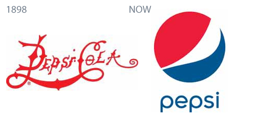
Pepsi, originally named ‘Brad’s Drink’ until it was renamed ‘Pepsi-Cola’ in 1898. The word ‘Cola’ was then dropped in 1962. The original logo (pictured) was red and swirly. Since then, thankfully, the logo has evolved into a much more modern representation of the company.
9. McDonald’s
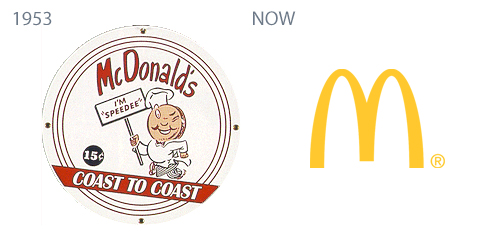
We’re sure it won’t come as a surprise that McDonald’s is the world’s largest fast food chain. Their 1953 logo displayed a cartoon chef named ’Speedee’ symbolising their fast service. This logo was less than popular, (especially in the opinion of Ronald McDonald!) and was replaced in 1962 with the well-known and loved logo, the golden arches.
10. Lego
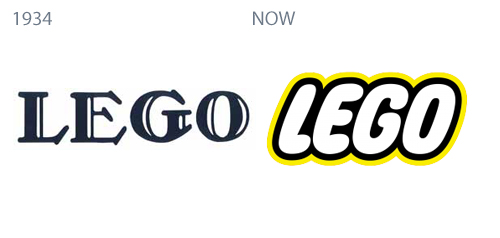
Lego, an abbreviation of two Danish words “leg godt”, meaning “play well” is a plastic construction toy manufacturer. Lego is very much adored by children all over the world. As times have changed, so has their logo, evolving in to a much more fun and modern design, adding a touch of colour.
11. Ford
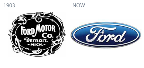
Ford is one of the world’s largest automobile manufacturers. Their bold 1903 logo was fashionable at the time, however it has since rolled with the times to become the easily recognisable blue oval logo that represents their brand today.
12. Nintendo
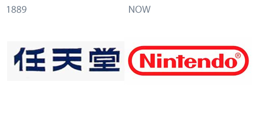
One of the oldest, and most beloved video gaming companies, is of course Nintendo. Nintendo was founded in 1889 in Japan, and is the creator of many adored characters such as, Super Mario, Princess Zelda, and many, many more. The company didn’t always sport the simple, attractive logo that they do today. Between the years 1889 – 1950, the Nintendo logo was displayed in the form of Japanese characters Nin, ten, and do.
13. Google
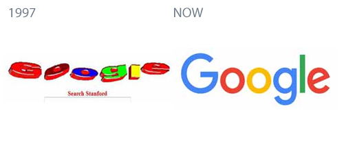
Google is unsurprisingly the world’s most popular search engine. Their 1997 logo however, was extremely far from being the world’s most popular design! Like a lot of brands, they’ve kept it simple over the years with a colourful display of the company name.
So what have we learned this Throwback Thursday? We think that simplicity can be key, but how do we know what’s going to work, how, why, when, and for what type of company? There are so many elements of design, and even more elements of ‘good’ design! Our extremely talented and skilled in-studio designers, are ready to bring your vision, and brand to life!
Give our dedicated team a call on 01292 280022 to collaborate with us and move your business forward today.

